We have a huge appreciation for sleek lines, a gorgeous color scheme, and beguiling statistics. Why? you might ask. Well, as the saying goes, “sexy design sells!”
Regardless of the liberties we may have taken with that famous adage, it is undeniable that information arranged in a clear and attractive format facilitates better comprehension, memorization, application, etc. We’ve worked hard to make sure that the SkyStats WordPress dashboard checks all those boxes so that users can analyze stats and apply what they learn to improving their online business performance. And we want to take it a step further.
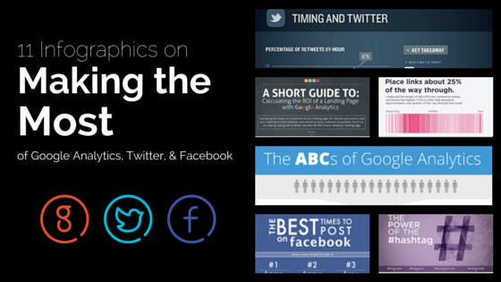
Because we love it when SkyStats users experience success, we’d like to provide some more attractively-packaged essential data that will contribute to improving the data that pops up on those beautiful widgets! In honor of our latest Twitter, Facebook, and Google Analytics integrations, here are some excellent infographics that can help you start seeing results that are as attractive as the SkyStats dashboard! (more…)

