We have a huge appreciation for sleek lines, a gorgeous color scheme, and beguiling statistics. Why? you might ask. Well, as the saying goes, “sexy design sells!”
Regardless of the liberties we may have taken with that famous adage, it is undeniable that information arranged in a clear and attractive format facilitates better comprehension, memorization, application, etc. We’ve worked hard to make sure that the SkyStats WordPress dashboard checks all those boxes so that users can analyze stats and apply what they learn to improving their online business performance. And we want to take it a step further.
Because we love it when SkyStats users experience success, we’d like to provide some more attractively-packaged essential data that will contribute to improving the data that pops up on those beautiful widgets! In honor of our latest Twitter, Facebook, and Google Analytics integrations, here are some excellent infographics that can help you start seeing results that are as attractive as the SkyStats dashboard!
Improve Your Stats on Google Analytics, Twitter, & Facebook
We’ve had these infographics bookmarked for a while, as we keep using their expertise to get the most out of our Google Analytics, Twitter, and Facebook. Put these tips to use and watch the data on your SkyStats widgets improve!
4 Super Helpful Infographics for Google Analytics Users
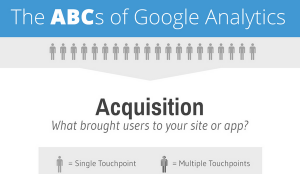
A super basic Analytics review (great for noob clients!), this infographic from E-Nor.com provides an excellent introductory look at Google Analytics. It’s focus is on the ABC’s (Aquisition, Behavior and Conversion) to give a surface value look at the power of Analytics as an online marketing resource. This infographic is particularly useful if you’re trying to explain Analytics to the completely uninitiated. Bookmark this infographic, especially for curious clients!
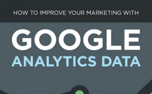
Here’s a great infographic showing how to use Google Analytics to improve your digital marketing efforts. Produced by Quicksprout and posted to the Smart Insights blog, it’s bound to be good! It holds some valuable insight into how to turn data from Google Analytics into actionable digital marketing improvements for your site.
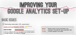
Here’s an excellent infographic from Tatvic.com on troubleshooting issues that regularly pop up with Google Analytics and setting it up properly. The graphic deals primarily with setting up your Analytics optimally, which is very important if you want Google Analytics to help your website and marketing efforts without bogging them down. Absolutely save this page and use it whenever you have any Google Analytics issues.
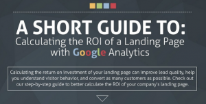
This helpful visual guide to calculating the ROI of a landing page from Formstack is pretty self explanatory. Like it says on the box, this infographic is a visual walkthrough to the process of determining whether or not you are getting any value out of that new landing page. Some good Analytics insights are available here that could be applied to determining ROI in other settings also. Definitely worth referring to time and again!
4 Super Infographics for Improving Twitter Stats
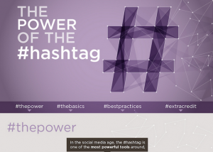
Not sure how to use hashtags to expand your social media reach? Perhaps you don’t know what to think/do about hashtags in the first place! Don’t get intimidated and definitely DON’T exclude hashtags from your social media strategy! Here’s an excellent guide how to to get hashtags working for your benefit, from none other than HuffPo.
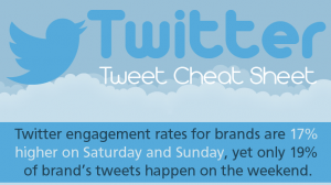
What types of content get the most retweets? When are followers more likely to engage with a brand’s tweets? How much should a business use hashtags in their tweets? These important questions and many more are answered in this excellent Twitter “cheat sheet” from Linchpin SEO.
The ever-dependable KISSmetrics blog has this excellent infographic that shares the best times and frequency to be posting to Twitter. Definitely worth bookmarking and referring to when planning your tweeting schedule! Bonus: it also provides the same answers for Facebook times!
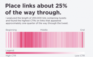
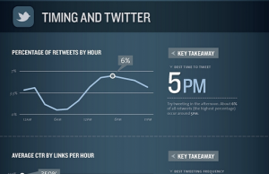
Sending tweets out regularly but not seeing any engagement? Of course you want your followers to be checking out your links, but you just can’t seem to find their sweet spot. Here’s an infographic from Dan Zarella, the “social media scientist” (a title this data rich infographic confirms) that explains how you should be tweeting to get more clicks.
3 Great Infographics for Improving Facebook Stats
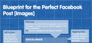
Constructing the perfect Facebook post can be a bit of a confusing art; you think you’ve got it figured out only to see your engagement rates plummet or likes decrease inexplicably. Thankfully Jennifer Burnham at the Salesforce blog has constructed an excellent blueprint of a solid Facebook post (which Jeff Bullas added some tips to) that you can confidently build upon! No more flying by the seat of your social pants!

Speaking of flying by the seat of your pants – when was the last time you checked to verify if you were posting your brand’s social media updates at optimum times for engagement and exposure? Sure, you could just take wild guesses, but wouldn’t it be worth getting the times right to enjoy the positive results? Here’s a great infographic in the best days and times to be posting to Facebook. Bookmark and refer to this page like your social life depends on it!
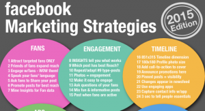
Struggling with coming up with ideas for your next Facebook marketing campaign? Here are 64 excellent Facebook marketing ideas that you can use within your campaign, or at the very least use in a brainstorming session to come up with some fresh strategies. A simple and excellent infographic from Maria Peagler (@SM_OnlineClass)!
SkyStats should be more than a pretty interface!
When you look at your SkyStats dashboard you don’t want to see just some pretty widgets – you want those widgets to display positive stats that shows your online marketing efforts are succeeding. We know you’ll be far more excited about using SkyStats when the attractive dashboard reveals some attractive data for your business, and we hope the infographics we’ve shared above will help make that happen.
Want to enjoy the gorgeous and incredibly useful SkyStats dashboard on your own WordPress site? It’s free!